- Home
 Atmolytics
-
Getting started
-
The Cohort Insights area
The Cohort Insights area
You can find the Home area of Atmolytics by clicking the house icon on the very top left of your screen. It comprises the Cohort Insights, Tracked Cohorts and Activity Centre areas. Click the buttons on the top right of the screen to move between them and access Cohort Insights:
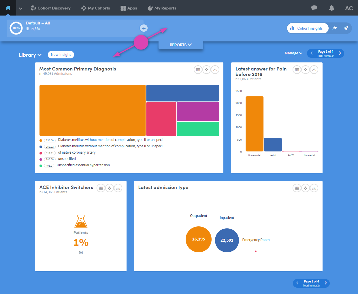
The Cohort Insights area enables in-depth exploration of any cohort you have access to. By default, it will display your base cohort, but you can select any of the cohorts available to you. You can then view and explore graphical representations of many different aspects of the cohort you select.
If you’re new to Atmolytics, you may not have many (or any) cohorts to explore, other than your base cohort. Once you start using Atmolytics to create and possibly share more cohorts, you’ll be able to view any of them in Cohort Insights.
As well as seeing insights that have been built into Atmolytics for you to view straight away, you can create your own custom cohort insights with just a few clicks, following a simple step-by-step process. You can select the cohort insight you wish to create, the data you wish to use and how the results should be visualised. You can also choose which insights to display, regardless of whether the cohort insight is an inbuilt system insight or an insight you have created yourself.
The Cohort Insights screen has two main areas: the menu bar and the exploration area.
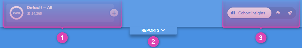
The top part of the Cohort Insights screen contains the following features:
-
1
Here you can see the name of the cohort you’re working with, and the number of patients it contains.
There’s also a plus button to the right of the cohort name. This enables you to compare one cohort with another.
-
2
This is the Reports pull-down menu. Click the down-arrow to expand the view:
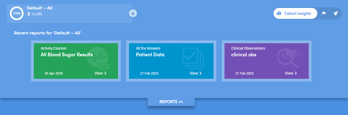
You’ll see a simple view of the most recent reports you’ve created. Click one to navigate straight to that report.
-
3
Click these buttons to toggle between the Cohort Insights, Tracked Cohorts and Activity Centre areas.
Exploring Cohort Insights
The bottom part of the Cohort Insights screen displays the data for you to explore:
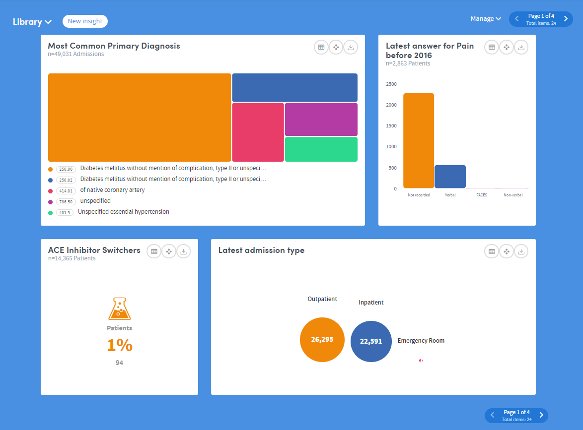
Depending on the data available to you, this section might show representations of demographic information, details of diagnoses, test results, costs, charges, or locations where patient interactions took place:
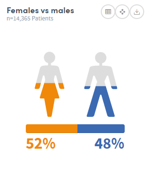
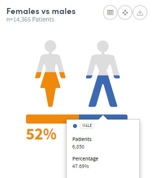
Hover the mouse over the images to see this information in greater detail:
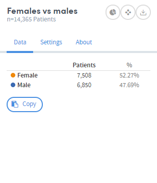
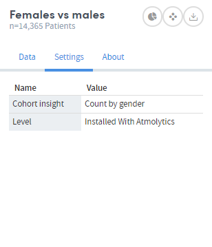
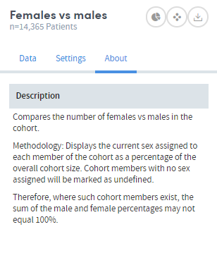
Click the table symbol on the top right of each insight to see the Data, Settings and About tabs. These give you more information about the data and methodology used to generate the insight:
More Cohort Insights features
As well as exploring existing data using cohort insights, you can:
Compare one cohort’s insights with another
Organize your insights into set

