The Cohort Insights screen is divided into two main areas: the menu bar at the top, and the exploration area below it:
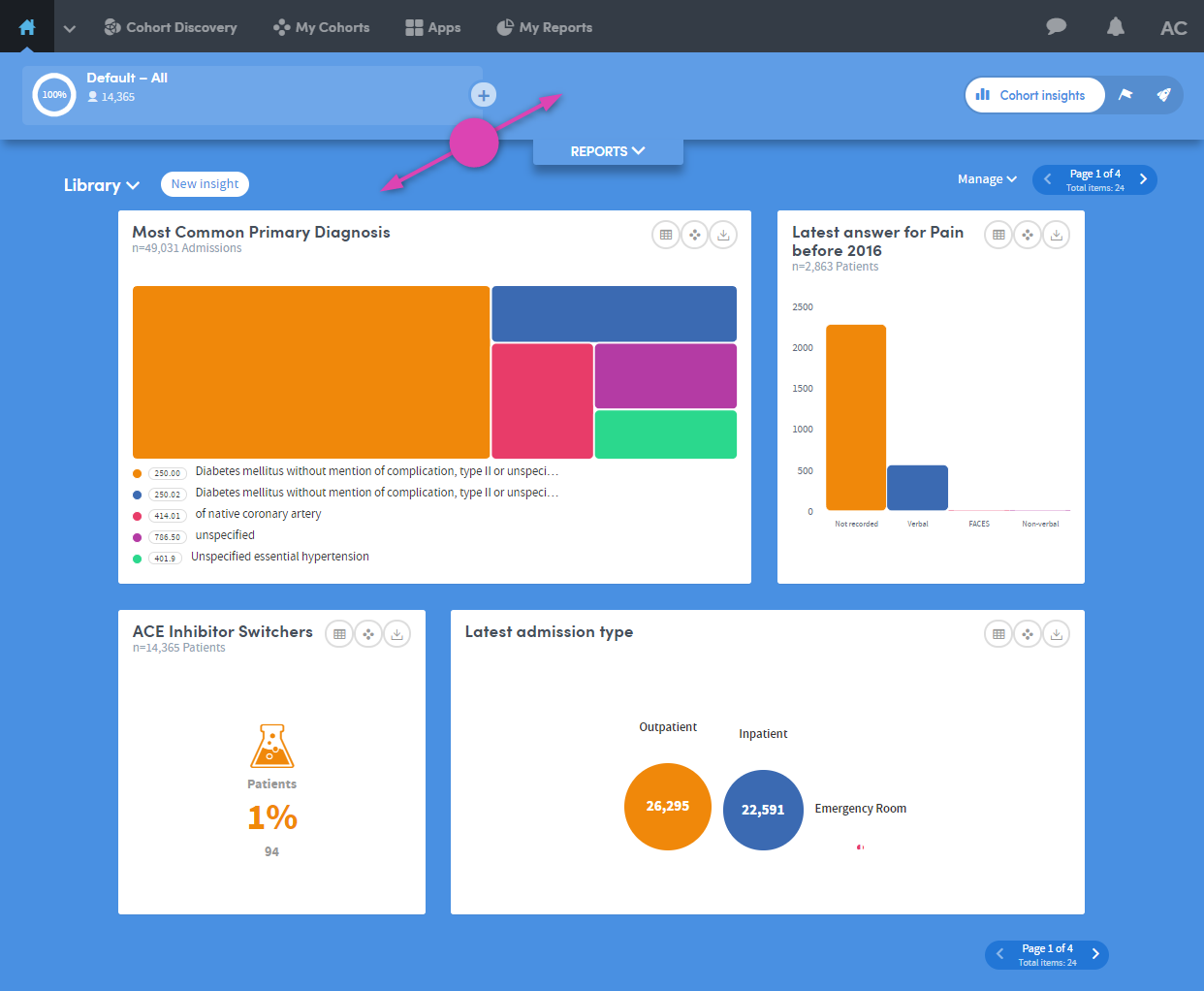
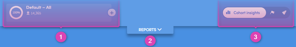
1 - Here you can see the name of the cohort you are working with, and the number of patients it contains.
There’s also a plus button to the right of the cohort name. This enables you to compare one cohort’s insights with another’s
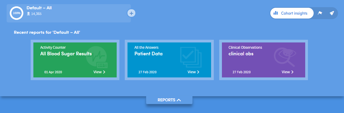
2 - This is the Reports pulldown menu. Click the down-arrow to expand the view .
3 - Click these buttons to toggle between the Cohort Insights, Tracked Cohorts and Activity Centre areas
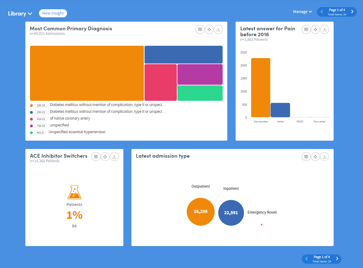
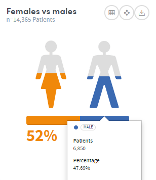
The bottom part of the Cohort Insights screen displays the data for you to explore:
Depending on the data available to you, this section might show representations of demographic information, details of diagnoses, test results, costs, charges, or locations where patient interactions took place:
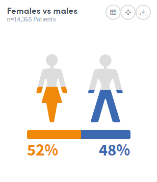
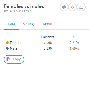
Hover the mouse over the images to see this information in greater detail:
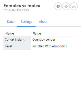
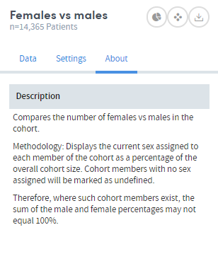
Click the symbol on the top right of each insight to see the Data, Settings and About tabs. These give you more information about the data and methodology used to generate the insight: