- Home
 Atmolytics
-
Cohort insights
-
How to create a new cohort insight
-
Cohort insight display options
Cohort insight display options
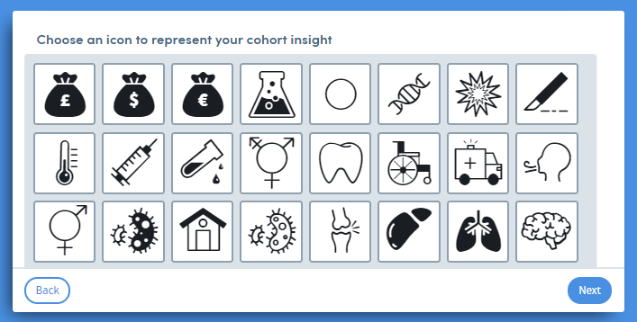
Depending on the type of insight and data you’ve creating, you’ll be given options about how you want to view the data on screen. For simple counts of data items, you may just need to choose an icon:
For more complex data you’ll select from appropriate chart types:
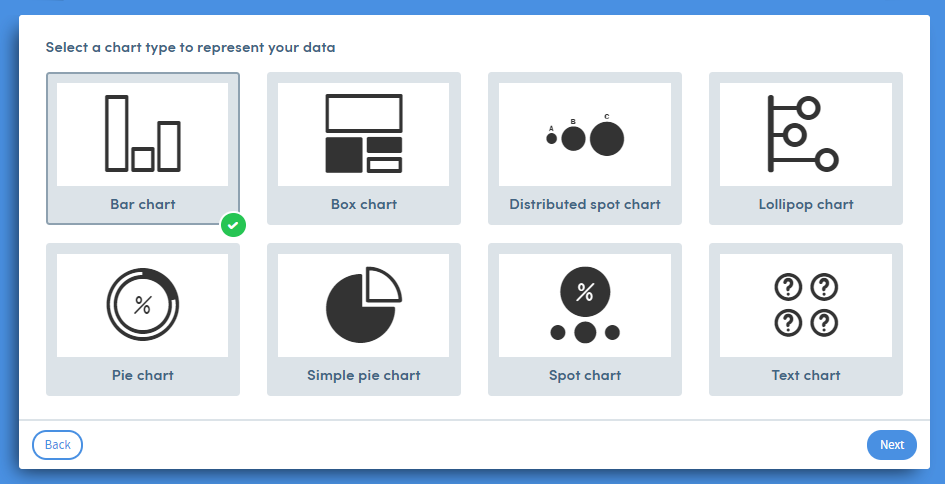
You may also be able to set the display parameters of the chart (again, this is dependent on the insight type and the data you have specified).
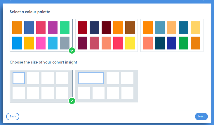
You will also be able to choose a colour palette, and the display size of the cohort insight in relation to others on screen: