- Home
 Atmolytics
-
Apps
-
All the Answers
All the Answers
All the Answers reports aggregate how many patients fall into each of a number of selected categories within a single dataset of your choosing.
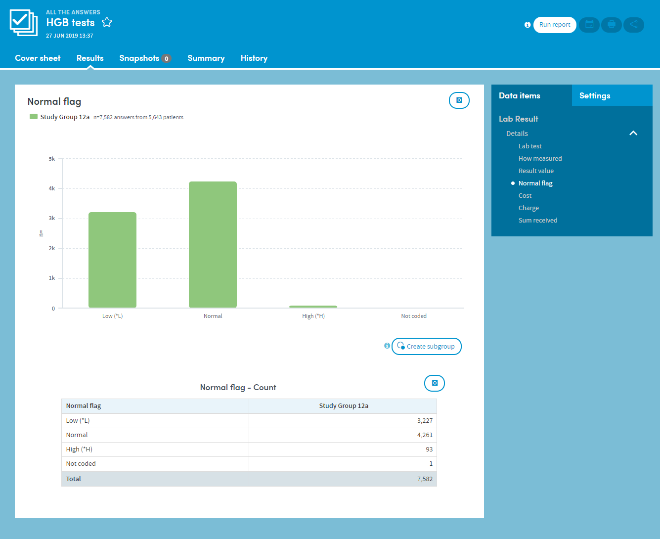
The output of any All the Answers report is a set of counts and percentages describing the frequency of occurrence of the answers to the questions contained in the selected form. These counts are displayed as both a table and charts.
The appearance of charts can be altered from counts to percentages and also manipulated in a number of other ways. These include: filtering out of low-percentage categories; adjustment of bandings; sorting by frequency; and creation of subgroups of interest. These outputs will be shown for any combination of up to two patients or cohorts that you have selected.
For example, you could produce an All the Answers report to find out:
- How many patients belong to different age bands.
- How many are of which gender.
- How many scored high, medium, or low on an assessment or lab test.
- How many patients gave each response in a survey or questionnaire.
Its features allow you to:
- Choose your preferred chart type, e.g. a pie chart to display gender, a bar chart to display ethnicities.
- Highlight items of most interest on a cover sheet.
- Band the data as you choose, e.g. age, length of stay.
- Choose a color scheme for each report.
- Arrange your outputs to make them easy to read, e.g. switch between counts and percentages, or sort them from high to low.